
A well-designed home featuring calming colors not only enhances aesthetics but also nurtures relaxation and well-being. These soothing shades can positively influence various aspects of your life, making it worthwhile to incorporate them into your interior decor.
Interior design professionals have long praised the benefits of peaceful color palettes. We've gathered insights from experts on the most effective color schemes to create a serene atmosphere at home.
Implementing a calming color scheme is simpler than you might think. You can refresh paint colors in just one day, while other furnishings can be updated gradually. Whatever approach you take, introducing soothing hues is a decision you'll appreciate.
Which colors create a calming atmosphere?
There are plenty of calming color combinations suitable for every room. To help you choose, we consulted interior design specialists who shared their favorite palettes and tips. From serene living room designs to peaceful bedroom color schemes, there's inspiration for every space. We'll also highlight colors to avoid for a truly tranquil area.
1. Opt for soft, light hues for a serene atmosphere
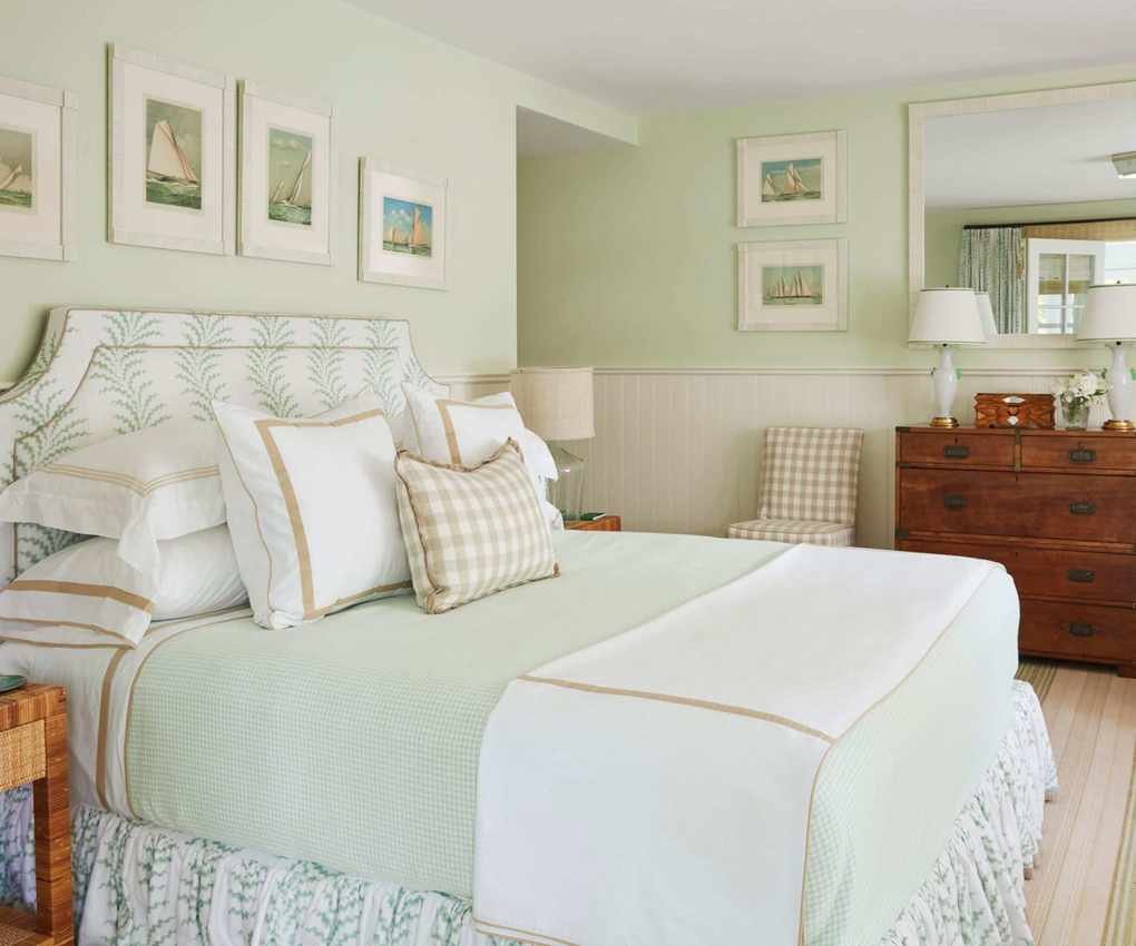
Soft, light shades rank high among choices for calming color schemes. Gentle blues and greens, along with the lightest yellows, create a soothing backdrop for daily living. These hues typically belong to cooler color families.
Atlanta-based designer Liz Williams favors soft blues and greens, noting that a blend of these colors fosters tranquility. In the serene bedroom shown, designer Gary McBournie chose a refreshing pale green for his Nantucket home revamp.
Designers Lathem Gordon and Cate Dunning recommend using a color wheel to guide your selections. They suggest, "Utilizing neighboring colors on the wheel helps create a more tranquil space."
Some of our recommended pale paints include: Morning Sky Blue and Heaven on Earth in blues; Light Pistachio and Par Four in greens; and Old Straw Hat, a delicate yellow—all from Benjamin Moore.
And what about the saying 'blue and green should never be seen'? We believe pale blues and soft greens can coexist beautifully in calming color schemes.
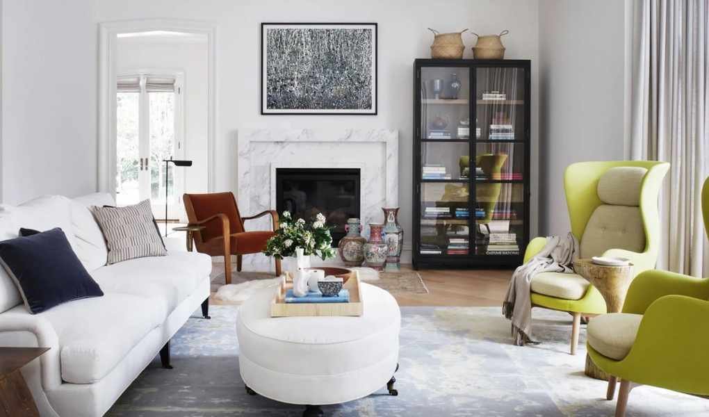
2. Incorporate white and cream while adding texture
While white and cream may seem basic, they are timeless choices for creating serene spaces.
An all-white or cream palette can foster a feeling of relaxation, but be cautious not to make the space feel too stark or lifeless.
Juliette Spencer, founder of Atelier RO in New York, advises, "I prefer whites and creams for calm, but adding texture is crucial to avoid sterility. Use varied textiles, rugs, and wall finishes."
Texture adds depth to your design. Layering materials like velvet, linens, and knits in pillows and throws enhances a white living room. The stunning all-white living room above showcases the work of Nashville designer Brad Ramsey.
For white paint suggestions, consider White Snow and Natural White from Sherwin Williams. For creamier options, check out Sanctuary and Dover White.
3. Embrace blush or coral for warmth

Warm hues can also create calming environments. Designer Liz Williams loves soft pinks and pale purples, advocating for blending these shades with whites and neutrals to cultivate a cozy atmosphere.
Lathem Gordon and Cate Dunning mention, "While we usually avoid warm tones for calm, light coral or blush can add a comforting vibe to a space."
These pink room ideas shine in bedrooms or living areas, while coral or blush also suit dining spaces. In Maison Vilucchi's elegant redesign of a 1980s LA home, the plaster walls were custom-made using a modified version of Vintage, a Benjamin Moore shade.
4. Reflect calming greens inspired by nature
We've already highlighted calming pale greens above, but darker greens can also provide a soothing effect.
"Green is inherently calming," shares Juliette Spencer. "It can be included in furniture, textiles, and rugs for a tranquil atmosphere."
Interior designer Heather Hilliard specifically praises sage green. "It's a restful shade that mirrors nature," she explains. "We enjoy pairing it with natural woods and linens." Incorporating leafy greens into your home can extend the calming influence of outdoor spaces indoors.
Consider using Benjamin Moore's Sage or Secret Garden for deeper green tones.
5. Explore darker hues for a cozy atmosphere

This might seem unexpected, but dark shades can foster a calming ambiance. If you prefer a snug, cocoon-like feel over an airy, open environment, consider dark hues for your living spaces.
Designer Heather Hilliard believes enveloping a room in deep shades—painting walls, trim, and built-ins the same color—can evoke calm and coziness.
These darker tones work wonderfully in dens and media rooms, creating indulgent, relaxing environments. Designer Judi Fuller designed the media room above in a Texas residence, utilizing Caviar from Sherwin Williams for a unified look, stating it's one of her favorite designs.
6. Colors to steer clear of in tranquil schemes
After discussing suitable colors for calming schemes, it's essential to identify which shades to avoid. Experts unanimously agree that vibrant, warm tones should be left out for a peaceful environment.
"Red and orange are fiery colors that can evoke energy, but they're not calming," warns Juliette Spencer.
"Bright colors like red, yellow, and orange are more active and energetic, which isn't ideal for creating a serene space," concurs Liz Williams.
Lathem Gordon and Cate Dunning also refrain from saturated reds and oranges when aiming for tranquility.
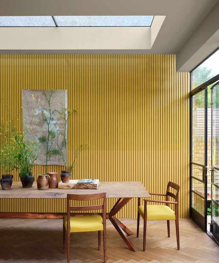
Interestingly, we admire Farrow & Ball's bold yellow, Babouche, showcased in the kitchen above. While it's visually stimulating and perfect for lively gatherings, it's best avoided in calming palettes.
Care should also be taken with certain whites, which might not yield the soothing effect you desire. Heather Hilliard advises against stark whites devoid of warmth in bedrooms.
Choosing paint colors involves more than meets the eye. Take your time selecting the right shades, testing sample pots and fabric swatches in the actual space being updated. This way, you can see how natural light interacts with your choices and assess whether they'll create the calming environment you envision.

