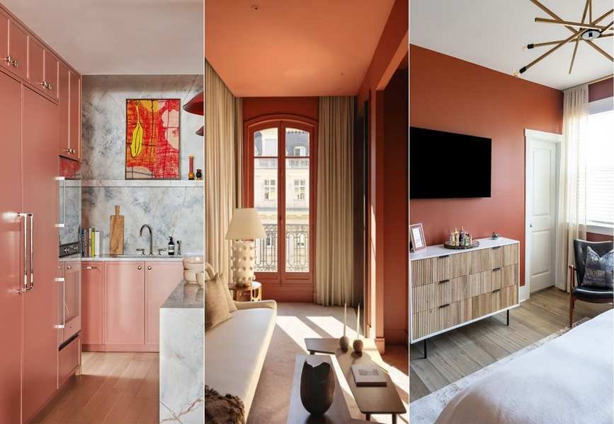
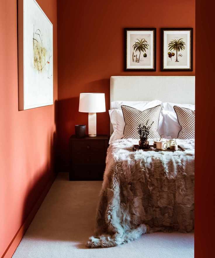
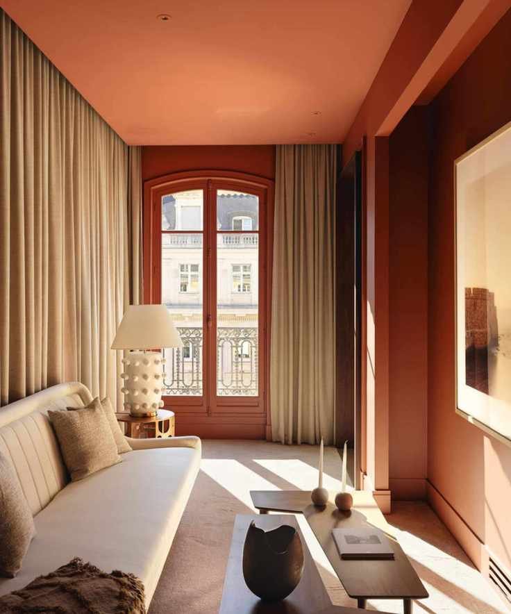
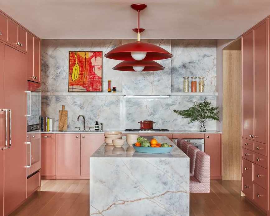
Warm color schemes are captivating homeowners, leading to a growing preference for cozy tones over cool shades. Among these, terracotta has emerged as a standout choice this year.
Terracotta offers a neutral vibe but with added depth compared to standard shades in this palette. Its earthy base combines pink, brown, and orange, instantly infusing warmth into interiors, reminiscent of sun-kissed landscapes.
With numerous terracotta options available, we consulted interior designers to gain insight into this popular hue. We also gathered their favorite paint inspirations to help you incorporate this lively color trend into your home decor.
Why is Terracotta So Favored?
According to interior designer Nicole Cullum, terracotta is trending in 2024 due to its earthy essence, which complements soft, warm neutrals beautifully. She describes it as a mix of red and orange that creates a rich, grounded brown.
These earthy tones can vary, leaning towards more orange or red. Nicole prefers deeper tones of brown and red for interiors, as they establish a more stable atmosphere.

Nicole Cullum is an interior designer located in Taos, New Mexico, and the creator of Color Caravan, a delightful collection of hand-painted wallpapers, textiles, bedding, and decor.
Tyson Ness, an interior designer, adds that terracotta shades harmonize with various design styles: 'Terracotta tones introduce warmth that complements nearly all color schemes. This earthy hue balances spaces and works well with diverse palettes.'

Tyson Ness leads Studio Ness, a full-service interior design firm in NYC. Known for its collaborative approach, the studio crafts unique spaces tailored to each client, drawing from over a decade of experience in the industry.
When styling a room with a bold terracotta shade, Nicole recommends selecting warm white paints: 'To balance a strong hue like terracotta, choose a light warm white without overly yellow, pink, or gray tones. Your wall color should have only a hint of warmth, as terracotta will amplify any warm undertones in your wall color and clash with cool grays.'
Top 6 Terracotta Paints
We've selected six outstanding terracotta paints favored by interior designers for a vibrant and contemporary look in 2024, ranging from muted to rich, deep hues.
1. Byzantine, Benjamin Moore
Interior designer Kathy Kuo loves Benjamin Moore's Byzantine and Persimmon. 'Byzantine features rustic brown undertones, making it a true earth tone that pairs easily with warm neutrals, ideal for wabi sabi decor and organic modern aesthetics.'
Byzantine by Benjamin Moore presents a terracotta rich in brown tones, perfect for pairing with soft, warm neutrals.

Kathy Kuo is an acclaimed interior designer with over 20 years in the industry.
2. Persimmon, Benjamin Moore
'Persimmon boasts lovely rose undertones, providing a feminine touch,' adds Kathy. 'This shade offers a more earthy, subtle twist on the pink trend. Pair it with blush or taupe furnishings, rose gold accents, and luxurious textures like velvet.'
Benjamin Moore's Persimmon delivers a pink terracotta that exudes warmth and elegance.
3. Red Earth, Farrow & Ball
Tyson Ness recommends Red Earth by Farrow & Ball for a timeless tone. 'For those who prefer muted colors, Red Earth is an excellent choice for a terracotta palette, offering a gentler approach compared to bolder shades.'
This true terracotta works exceptionally well in smaller spaces.
4. Kalahari Sunset, Behr
'Behr's wide array of terracotta shades includes Kalahari Sunset, which stands out with its darker, rustic appeal,' notes Erika Woelfel, VP of color and creative services at Behr.
Using terracotta can introduce warmth and an organic feel to your home. Kalahari Sunset pairs beautifully with muted greens like Park Bench or neutrals such as Even Better Beige, enhancing the inviting essence of terracotta.
This deep hue creates a cozy ambiance.
5. Georgian Leather, Glidden
Ashley McCollum from Glidden suggests Georgian Leather for terracotta decor. 'This saturated, earthy tone is perfect for gathering spaces like living rooms. Combine it with muted teals and neutral accents for a cohesive design.'
Georgian Leather presents a light terracotta enriched with golden undertones, ideal for pairing with soft whites.

Ashley McCollum is a color expert at PPG, specializing in architectural coatings.
6. Fired Brick, Sherwin-Williams
Nicole Cullum shares her favorite Sherwin-Williams terracotta, Fired Brick. 'It features a beautiful blend of brown and red, with a hint of orange, creating a bold, earthy appeal. This shade looks stunning on cabinetry against soft whites like Sherwin-Williams' Downy or Benjamin Moore's Navajo White.'
Sherwin-Williams' Fired Brick is a deep red-terracotta that embodies elegance and classic style.
In 2024, expect to see terracotta continue to shine in home decor. Its versatility allows for warmth and adaptability to various styles, making it a perfect choice for any interior.

